In the 10 years of its existence, this site has undergone many rewrites:
- WordPress (June 2013)
- OctoPress (Late 2013)
- DocPad (2014)
- Custom gulp-based site generator (2015)
- Custom webpack/mdx-based site generator (2019)
And since last week, we're at relaunch number 6!
What's New: Design
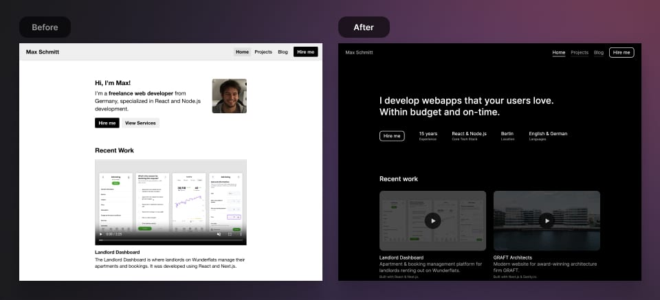
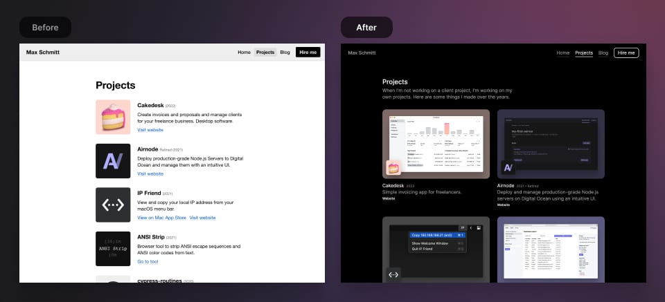
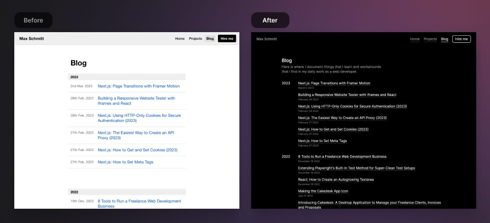
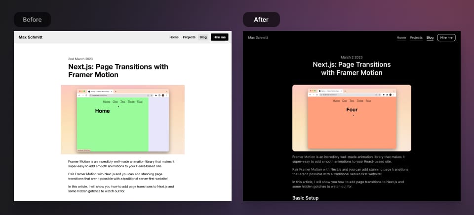
My old site design was getting out of date, so I've been wanting to refresh the look for a while. Here are the befores and afters:
Homepage
This is mainly where I advertise my services as a freelance web developer.
Projects Page
A showcase of my personal projects. Now including screenshots instead of just logos.
Blog
An index of all the articles I've written over the years.
Post
A single blog post, usually containing text, images, videos and code.
If you're curious about the old design, you can still view it at 2019.maxschmitt.me.
What's New: Custom Syntax Theme for Code
In the last version of my site, I was already using a custom syntax theme for code examples, but I was never quite happy with it.
This time, I came up with a theme that I really like. Here is some example code for you to look at:
lib/formatDate.ts
import dayjs from 'dayjs'function formatDate(date: string) {return dayjs(date).format('MMMM D YYYY')}export default formatDate
What's New: Auto-Balanced Post Titles
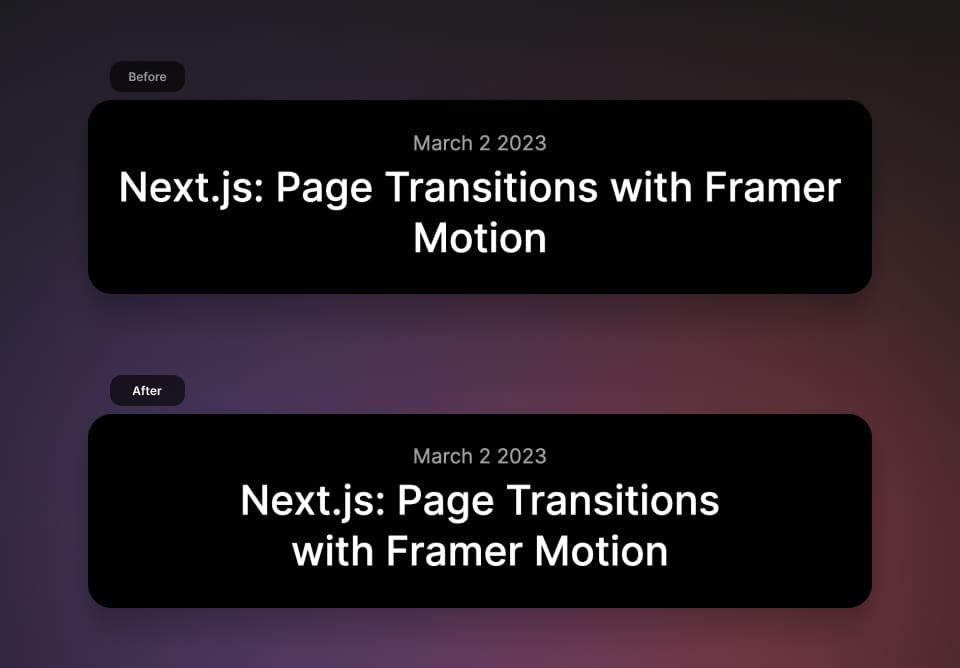
For post titles, I've integrated a package called react-wrap-balancer. It makes sure that headlines are nicely balanced if they span multiple lines.
This particular package works with SSR/SSG and doesn't cause layout shifts. Amazing!
Here's how post titles look with and without react-wrap-balancer:
What's New: Great Lighthouse Score
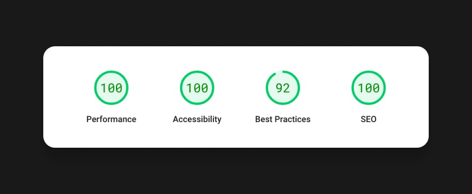
Of course these days, you have to have an impressive lighthouse score. Next.js makes that pretty easy and I'm glad to see that this site's score is almost perfect without even trying too hard. 😎
Moving on From my own Static Site Generator
I liked having my own static site generator setup and I had learned a lot while building it. But the development experience was lacking and builds were slow.
That's nothing that couldn't have been solved but I was tired of messing around with Webpack.
And since I've been doing a lot of freelance Next.js development, I decided that along with a refreshed look, I would also port my site over to Next.js and Tailwind CSS (previously using Emotion).
My First Tailwind CSS Experience
I've been following Adam Wathan's work for many years and I've always been eager to try out Tailwind CSS. With my new site I finally got the chance:
It took me maybe 30-60 minutes to gather my new design's fonts, sizes and colors and figure out how to represent them in a Tailwind config. It was a daunting task for me but it was a lot easier than expected.
After the initial setup, learning how to do things in Tailwind was super smooth. All the class names are very intuitive and the docs are amazing. Not having to write CSS or coming up with class names speeds up the workflow more than you can imagine.
Some Tailwind features are just brilliant, for example arbitrary values – I use them a ton!
Trying out Next.js 13's App Directory
Next.js 13 introduced the so-called App Router – the app/ directory that will replace the current pages/ directory.
It's still in beta and not everything works yet (as documented on the roadmap). I had to find workarounds and make compromises in a few areas but overall everything is working pretty well.
Overall I love the new separation of layout.tsx and page.tsx, it makes a ton of sense, and I'm looking forward to the next upgrades where everything gets smoothed out!
Conclusion
I'm really happy that I made the redesign and used the opportunity to learn Tailwind CSS.
It's going to be a lot more fun to update my site in the future since I have a better workflow and a simplified codebase.
And soon, I hope to bring back my RSS feed and also a light mode.
If you find any issues, please let me know either via email or Twitter!