I started writing this on the plane back from my vacation in Tenerife. It was great to escape the depressing Berlin winter and catch some sun before Christmas.
And also a great time to put the finishing touches on the new Cakedesk website which I’ve been working on since early November on nights and weekends.
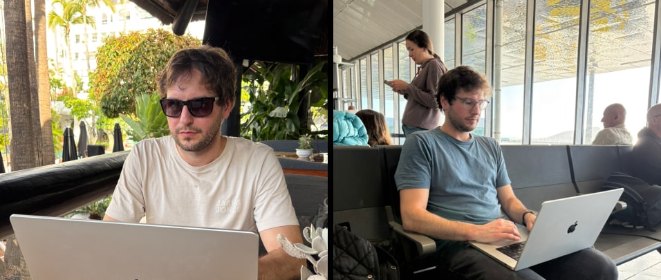
Favorite vacation pastime: Lying in the sun by the pool Working on Cakedesk
Let me take you behind the scenes to show some of the details and tech behind the new site.
Evolution of the Site’s Design
V1 Prelaunch (2022): The first Cakedesk website launched over 3 years ago, in April 2022, when the app was in Early Access.
At that time, I just needed to get something out with a clear and friendly design:

V2 Launch & Post-Launch (2022-2025): Over time the site got more complex: License manager, docs, articles, changelog, comparison pages, online invoice/proposal generators and more.
The simple design held up pretty well even though things started to get a little crowded and a bit pink:
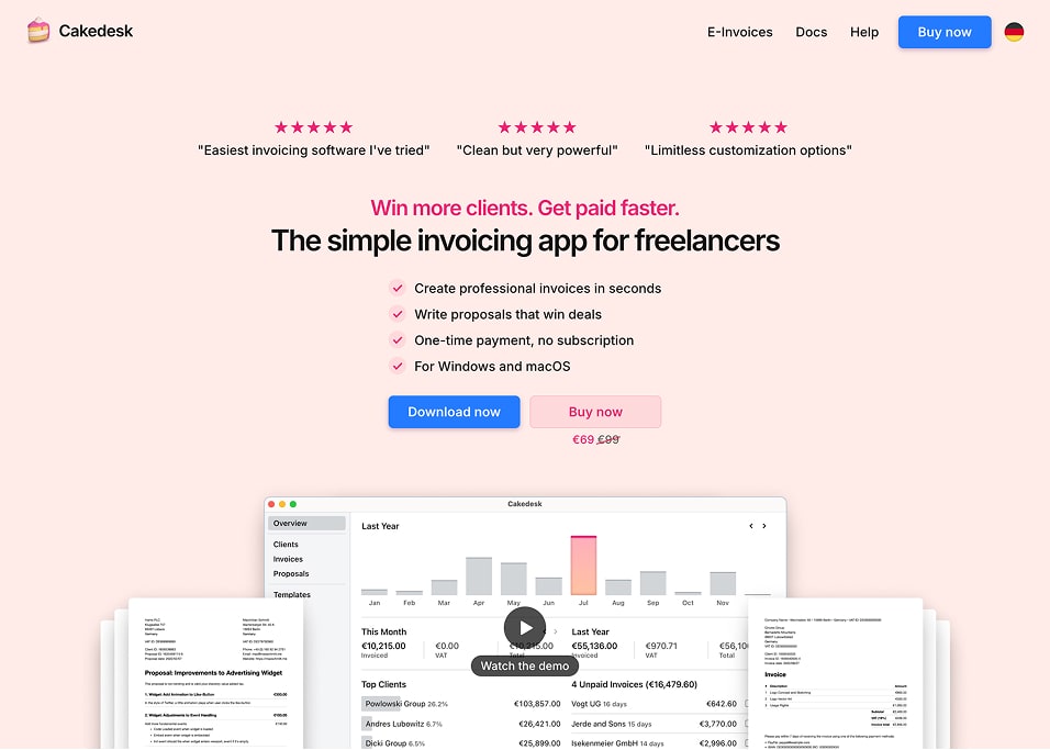
I’m proud of this website but the look has gotten a bit dated. The pink was getting out of hand and I didn’t like how blurry the scaled down screenshots looked.
A New Look
On a late Friday night in early November, I felt inspired to give the site's design a refresh.
Today, I'm happy to be launching it and I'd love to give you a closer look at some of the details.

Details & Behind the Scenes
The new look was a great opportunity to improve some of the tooling behind the site which enabled me to ship a few nice little details.
Here's a closer look at some of them:
1. Animations
I'm not usually a fan of animations on websites. For this site, I couldn't resist adding them where I felt like it made the experience a bit more delightful:
2. Screenshots
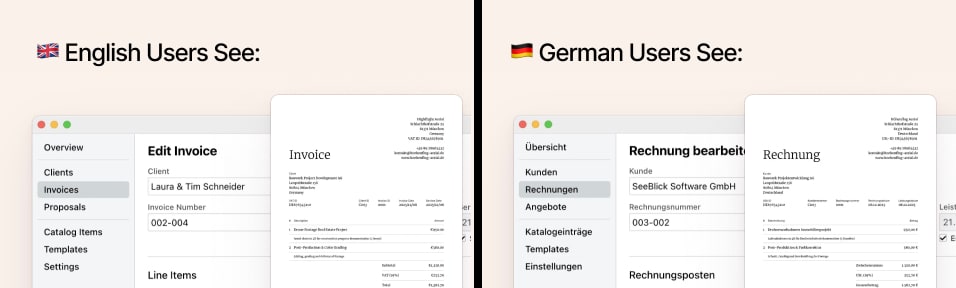
Creating all the screenshots for the new website ended up being a huge chunk of the work.
I wanted them all to be consistent, localized, available in light/dark mode and platform-aware. Creating them manually was slow and frustrating.
Translations: Every screenshot and invoice image is taken in English and German:
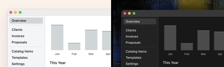
Light & Dark: Each screenshot is available in both light and dark mode:
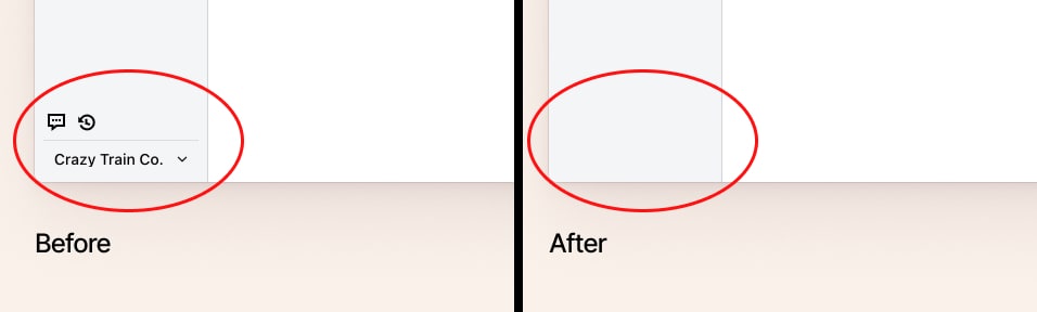
Noise Removal: Some UI elements make sense inside the app but add visual noise on a marketing page, so I removed them for the screenshots:
Taking Screenshots Automatically
Creating this many screenshots manually would be a lot of work, so I wrote a script that does it for me.
The script creates Cakedesk installations with realistic-looking data in both English and German, opens the app, navigates to different screens, removes certain details and takes screenshots in dark mode and light mode.
Seizure warning:
The video shows screenshots being generated in English. The same script runs again to generate them in German as well.
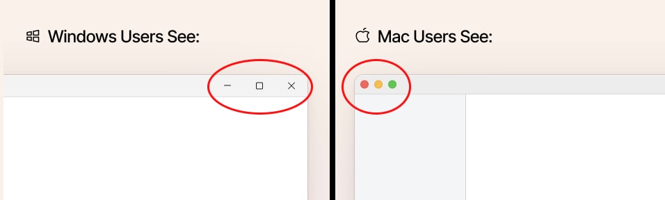
Dynamic Window Frames
The screenshots themselves don't include the Window frames. Those are rendered on the website using HTML & CSS.
This makes it possible to switch between light and dark window frames and even adapt them to the user's operating system:
3. Custom Focus Styles
I always refer back to Thomas' article on focus outlines (one of Cakedesk’s first users btw 🤓) when implementing these for a website:
4. Custom Text Selection
A very small detail, but one I really like:
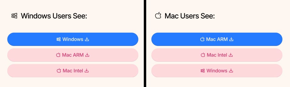
5. Platform-Aware Download-Buttons
Since Cakedesk is a desktop app, download buttons matter more than they would on a typical SaaS landing page.
Depending on your platform, the order and color of download-buttons changes:
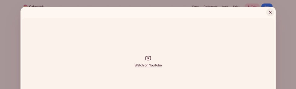
6. Handling Blocked YouTube Videos
Embedded videos don't always load, for example in the case of privacy tools or social media blockers.
So if Cakedesk's video demo on YouTube fails to load, a little fallback-link is shown instead:
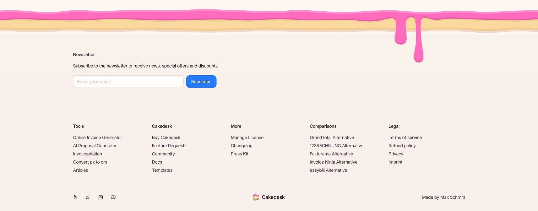
7. Tasty Footer
Cakedesk's edible footer got a little refresh to feel a bit more spacious, make room for social media and newsletter promotion and adjust to the new colors:
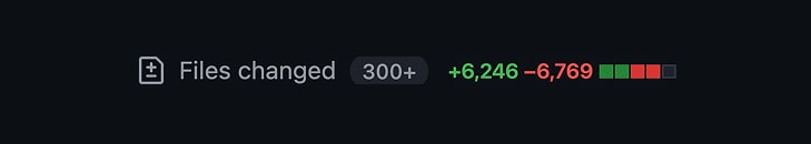
Under the Hood
Even though the new site is a lot more polished with many more details, overall the site's codebase was reduced (mostly due to replacing a lot of old CSS code with Tailwind classes):
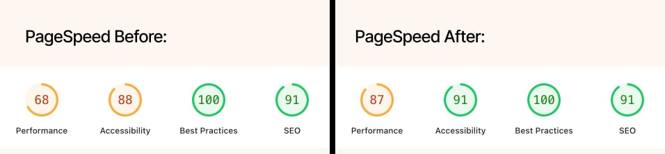
I was also able to improve the site’s lighthouse score quite a bit even though it still needs a bit of work:
Check it out!
You can find the new website live at cakedesk.app. For comparison, the old site is still viewable at 2023.cakedesk.app.
If you find any bugs, issues or spelling mistakes, please let me know. Thanks for reading and checking it out! :)