In the landlord-dashboard that we're building at Wunderflats, we're making use of quite a few modals to make navigating between e.g. booking requests fast.
A recent change made it so that the most important buttons in our booking request modals, the buttons to accept or reject a booking request, were not always visible on mobile.
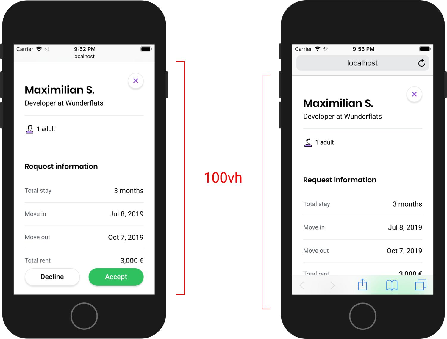
Most mobile browsers change their UI when scrolling to become more minimal (see left phone).
As we found out, this change in the amount of visible screen space for the user has no affect on elements that use height: 100vh.
If you want to make sure that your modal always uses the full visible height, you can use position: fixed; instead:
CSS
.modal {position: fixed;top: 0;right: 0;bottom: 0;left: 0;}
By using position: fixed; top: 0; bottom: 0;, your modal will always be completely visible:
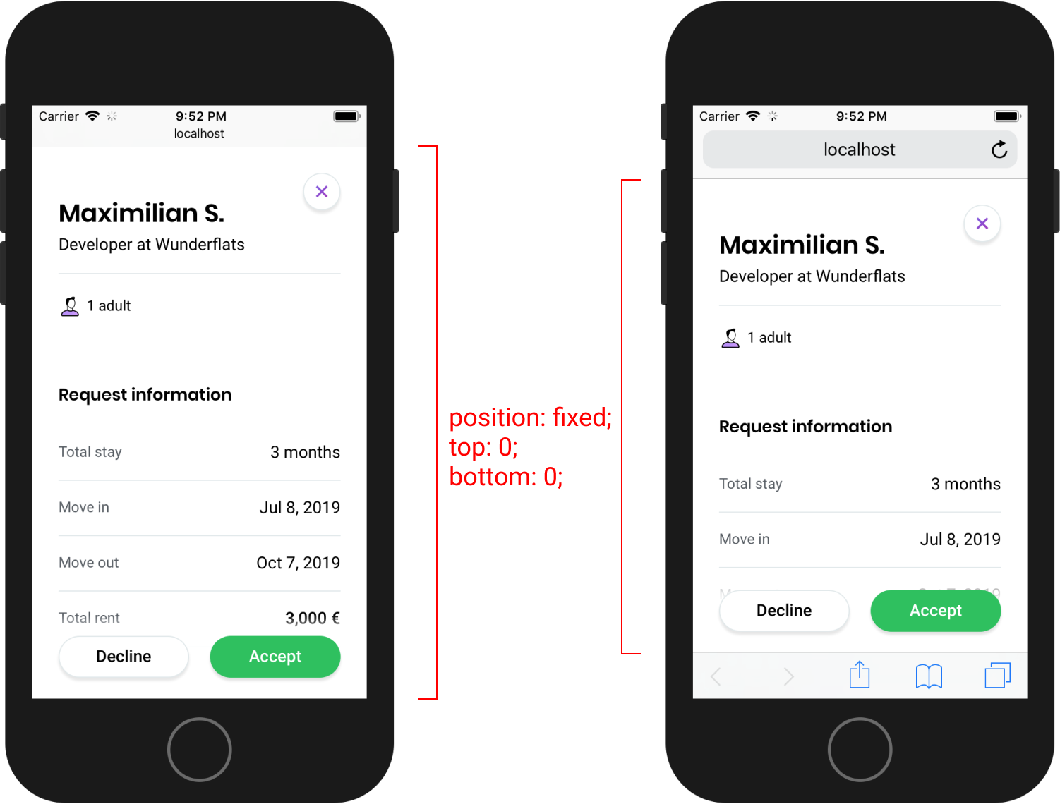
By the way, did you notice that subtle scrollable indicator behind the buttons (see right phone)? It's a cool little thing that our awesome designer Roman came up with. 😍 Give him a follow on Twitter to see what else he's up to!