In this article we will look at how we can implement Material Design's popular floating input labels with React.
It's a fun little exercise and it's not actually too difficult.
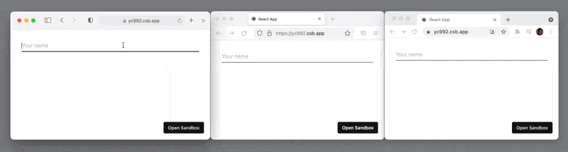
If you'd like to skip ahead, feel free to check out the CodeSandbox.
Floating Labels Anatomy
To make floating labels work, we need to work with three elements:
- The
<input>element - The floating
<label> - The container
<div>
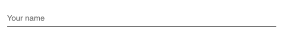
Empty State
When the input is empty, the label will float over the actual text input, exactly in the same position where any user input would appear.

Filled State
When the text input has a value, we will move the label up and out of the way while also scaling it down a bit.

Floating Labels React Component
Keeping in mind the two distinct states (filled vs. empty) and our three elements, we can go ahead and implement the React part of our component:
JS
function TextField({ id, label, style, value, onChange, ...rest }) {const isEmpty = String(value || '').length === 0const isFilled = !isEmptyreturn (<divclassName={['TextField', isEmpty ? 'TextField--isEmpty' : '', isFilled ? 'TextField--isFilled' : ''].join(' ')}style={style}><label className="TextField-label" htmlFor={id}>{label}</label><input {...rest} className="TextField-input" id={id} value={value} onChange={onChange} /></div>)}export default TextField
To keep things simple, we're assuming our component is always controlled (not optionally uncontrolled).
Floating Labels CSS
When implementing the CSS for the Material Design floating labels, pay special attention that the label's text is aligned exactly with the input's text.
Especially getting this to work across browsers is a bit tricky, but I've left some tips in the comments below:
CSS
.TextField {position: relative;line-height: 0;}.TextField-label {position: absolute;font: inherit;transition: transform 200ms;transform-origin: top left;color: gray;pointer-events: none;line-height: 1;display: block;}.TextField--isFilled .TextField-label {transform: translate(0, -1em) scale(0.8);}.TextField--isEmpty .TextField-label {transform: translate(0, 0.5em) scale(1);}.TextField-input {/* 💡 Make sure that the input's text styles are the same as the label's: */font: inherit;/* 💡 Setting 'box-sizing: content-box;' really helps makingthe height of the input predictable and consistent acrossbrowsers: */box-sizing: content-box;height: 2em;line-height: 1;margin: 0;padding: 0;border: none;border-bottom: 2px solid gray;outline: none;width: 100%;}
Testing Text Alignment of Label and Input
To test the text alignment of the label with the input, it can help to disable the styling for the filled state:
JS
/* .TextField--isEmpty */ .TextField-label {transform: translate(0, 0.5em) scale(1);opacity: 0.5;}/*.TextField--isFilled .TextField-label {transform: translate(0, -1em) scale(0.8);}*/
Conclusion
That's the basics of implementing Material Design's floating labels with React.
Thank you for reading, I hope this article was helpful to you.
Check out the CodeSandbox for the complete implementation.