What's the point of reading progress bars?
I'm talking about the bars that run across the top of the screen as you scroll through an article:
As I'm scrolling down the page, my browser's scrollbar already tells me how much of the article I have left to read.
The built-in scrollbar is where my eye naturally goes to see how far I've read. And it works on every site.
Putting another scrollbar across the top of the page just causes additional distracting movement.
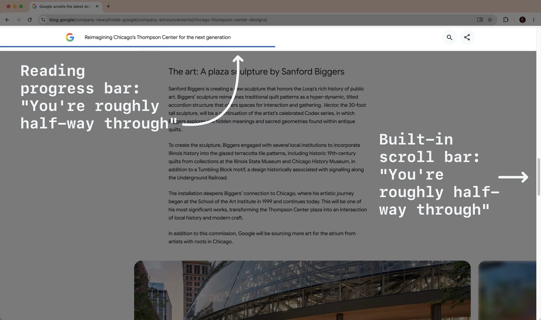
Even on pages with large headers and footers, the scrollbar is a close-enough approximation of how much I have left to read.
So why add another horizontal non-interactive scrollbar for vertically scrolling content?