The core problem is that toasts always show up far away from the user's attention.
Take a look at this example from YouTube:
The Problems with the YouTube Toast
In this particular example, the entire interaction is quite jarring:
- I click the "Save" button on the right-hand side of the screen
- A modal appears in the middle of the screen
- The toast appears in the bottom left corner
And there are a few more problems in this particular example:
- The toast is delayed without a loading indicator
- If I check or uncheck a checkbox in the modal, I need to wait multiple seconds for the previous toast to disappear before I get the confirmation toast for the latest action
- The "Undo" button in the toast is unnecessary because the user can just click the checkbox again
The Solution: No Toast
Here is a simple redesign of the "Save" interaction that solves all the problems above:
- The playlists are shown right beneath the button instead of in a modal
- After checking/unchecking a checkbox, a loading indicator is shown
- When the loading indicator disappears, it implies the action has completed
- No toast necessary!
2 More Examples
1. Confirming that Something was Added/Removed
When archiving an email in Gmail, a toast appears showing confirmation. But by archiving the email, the email disappears from the list, which already implies the action was successful.
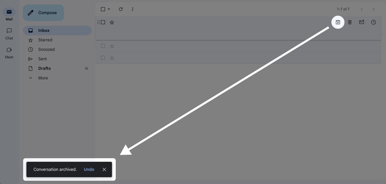
Note
We do have to consider the undo-functionality and that the toast feedback can be useful when using keyboard shortcuts.
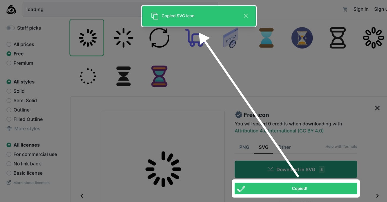
2. Confirming that Something was Copied
A toast is shown after something was copied to the clipboard. In this example, the button already includes a confirmation so the toast is entirely unnecessary.
It Could be Worse
What's worse than a toast? No feedback at all.
So if you don't have time to design or build a better feedback mechanism, a toast is better than nothing.
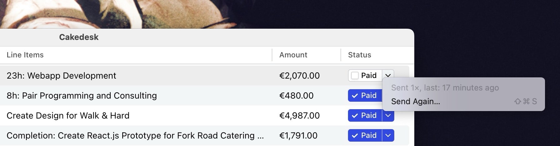
Bonus: How I'm Avoiding Toasts in Cakedesk
In Cakedesk, my offline-first, subscription-free invoicing app, users can send emails right from the app.
I was tempted to use a toast for feedback after the user hits "Send" on an email. Here is an alternative I came up with:
Here's how it works:
- Unsent invoices have a "Send" button in the list
- When sending an email, the modal stays open and sending is indicated on the submit-button
- After a successful send, the email animates out of the screen, indicating that the email was sent
- The "Send" button in the list turns into a "Paid" checkbox (confirming that the email was sent and giving the user access to a next useful action)
Additionally, the user can always click the context button to see that the email was sent: