In this post, we’ll be looking at how highlighting the last active item in a list can help users maintain a sense of orientation while navigating through lists.
Then we'll look at how to implement this technique using React (keeping track of the last active item can be a little bit tricky).
First, check out this little demo:
You can see how the subtle highlight on the last active item helps the user find where he left off.
The highlight is especially effective in mobile applications where it is common for the layout of the entire screen to change between list-view and detail-view.
Note
The longer the list and the longer the user views the details-view, the harder it will be for the user to find where he left off on the list.
In desktop apps your list might exist alongside sidebars or modals on a bigger screen where the eye must travel significant distance when switching focus from the list to the detail-view. Here it is also easy for a user to lose track of which item he viewed last.
By the way – the app you’re seeing in those videos is what we’re building at Wunderflats to help our landlords manage their apartments and bookings. It looks so sexy thanks to our awesome designer. Give him a follow on Twitter @RomaTesla! 😍
iOS also subtly highlights the last active item when transitioning from a details-screen back to a list.
How to highlight the last active item in a list using React
If you feel like skipping ahead, here is the complete example on CodeSandbox.
Highlighting the last active item can be easily achieved for traditional <ItemList /> components that take an array of items and an optional activeItemId as props.
All we need to do, is keep track of the lastActiveItemId and apply a CSS class to the item that was last active.
JS
const propTypes = {items: PropTypes.arrayOf(PropTypes.shape({id: PropTypes.string.isRequired,title: PropTypes.string.isRequired,})).isRequired,activeItemId: PropTypes.string,onClickItem: PropTypes.func.isRequired,}function ItemList({ items, activeItemId, onClickItem }) {// We will write a custom hook that returns the lastActiveItemId// based on the activeItemId (coming up below)const lastActiveItemId = useLastActiveItemId(activeItemId)return (<ul className="ItemList">{items.map((item) => {// For every item, check if it is currently activeconst isActive = item.id === activeItemId// or if it was last activeconst wasActive = item.id === lastActiveItemIdreturn (<li key={item.id}><button// If the item is or was active, we apply// the respective classNameclassName={wasActive ? 'was-active' : isActive ? 'is-active' : ''}onClick={() => onClickItem(item.id)}>{item.title}</button></li>)})}</ul>)}
The above code should look pretty familiar if you have some experience using React.
Now let's take a look at our custom React hook useLastActiveItemId(activeItemId). The trick here is that we only want to return
a lastActiveItemId if activeItemId is null.
In other words, we only want the last-active-highlight to show when the user has no item selected.
JS
function useLastActiveItemId(activeItemId) {// Create a ref that will remember the lastActiveItemIdconst lastActiveItemIdRef = React.useRef(null)// If activeItemId is not set, we will return the lastActiveItemId// that we rememberedif (activeItemId == null) {return lastActiveItemIdRef.current}// Otherwise, we'll remember the value of activeItemId// and return null for lastActiveItemIdlastActiveItemIdRef.current = activeItemIdreturn null}
On the CSS side there are two essential classes that we need to implement:
.is-activerenders a gray background on the active item.was-activetriggers a simple CSS animation that fades the background from gray to transparent over the course of 2 seconds
CSS
.is-active {background: #efefef;}.was-active {animation: fade-out-background 2s;}@keyframes fade-out-background {0% {background: #efefef;}100% {background: transparent;}}
That's all it takes to highlight the last active item in a list with React. As you can see, it's very easy to just sprinkle that behaviour into any list component thanks to React hooks.
Check out the complete example on CodeSandbox.
A quick note about focus states
It might be worth mentioning that, if you manage the focus states in your React app properly, your approach here might be a bit different.
When the user selects an item, the modal that presents the item details will get focused. Once the modal gets closed, the focus would return to the user's last position in the list.
If the focus styles in your app are visible, this would be enough to keep the user oriented (beware though that focus styles are generally not visible on mobile).
Check out the adjusted CodeSandbox using focus states.
Minimal CSS-only version
There is an alternative to the techniques outlined in this article so far that helps users maintain a sense of orientation as they navigate between items in a list. And all it requires is a little bit of CSS.
The :visited pseudo-class on anchor tags (<a href="..." />) allows us to style links that the user has visited before.
a:visited {color: purple;}
See the documentation for :visited on MDN.
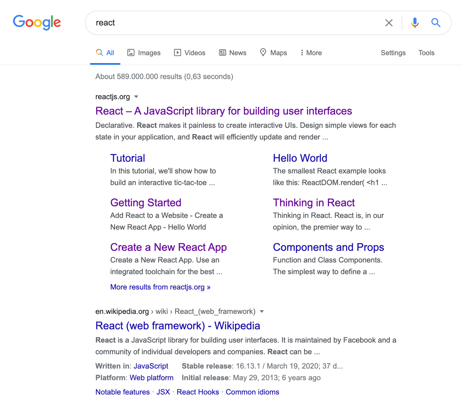
Many big sites like Google, eBay and Booking.com use this CSS-only approach, as it is perfect for search results of any kind.

In order for the :visited technique to work, you need to make sure that your navigation items are actual links (not just buttons that call setState when clicked). So for making use of :visited in a React app, you will need to look into adding some kind of routing solution.
You learned how highlighting the last active item in a list can help users find their way back to where they left off and you learned how to implement this little UI detail using React.
Special thanks to my friend Jorge who provided feedback before releasing this post.